
Dorian
From First Session to Daily Habit
The content was there. The reason to come back wasn't.
My Role
User Research
Product Design
Visual Design & Animation
Tools
Figma
The Core Team
VP of Content
VP of Marketing
Director of PM
VP of Engineering
Overview
Dorian is a UGC narrative game platform where creators publish and monetize interactive story games. The product had strong creator content and solid monetization — but too many new users were churning before they ever got hooked.
As Director of Product Design, I led the end-to-end design of a new retention system: from user research through systems design, UX, visual design, animation, and A/B-tested rollout across dozens of games.
The result was a 20% lift in D7 retention — driven by two interlocking systems designed around the same principle that makes learning products work: give users a clear sense of what they're working toward, and make the progress feel real.
Defining the Problem
My first move was research, not solutions. I ran rolling FTUE playtests to identify friction points in the day-one experience, and personally conducted 30-minute 1:1 interviews with our most engaged users to understand what was keeping them around.
The contrast between churners and retained users was sharp — and instructive.
New users churned because:
The product felt expensive, with no way to earn free currency
They didn't understand what they were working toward
Engaged users stayed because:
They liked the sense of building a relationship with characters
They liked feeling like their choices in the game mattered
That second finding was the more important one. Retained users weren't just consuming content — they were progressing toward something meaningful. They had a sense of investment and forward momentum that new users never got a chance to develop.
This is the same dynamic that drives retention in effective learning products: not the content itself, but the feeling that you're becoming something. The design challenge was to engineer that feeling from day one, before users had time to churn.
Solution 1: The Sapphires Economy
The cost perception problem had a structural constraint built in. Dorian operates on a creator revenue share model, which meant we couldn't distribute large amounts of free premium currency without cutting into creator earnings. The usual free-to-play playbook wasn't available to us.
So I designed around the constraint rather than against it.
I led the creation of a new platform-level currency — Sapphires — that existed separately from the creator monetization economy. Sapphires could be distributed freely to new users as rewards without affecting creator revenue at all.
To give Sapphires an earning mechanic with real habit-forming teeth, I designed a daily login streak system. Log in each day and earn Sapphires. Complete an episode on that day and earn a 2X bonus. The mechanic created a simple, repeatable daily ritual — the kind of low-friction habit loop that sits at the core of every successful retention system, from Duolingo's streaks to fitness app check-ins.
The streak was supported by a new Rewards screen that made progress visible and satisfying, giving new users an immediate sense of reward and a reason to return tomorrow.
Solution 2: The Goals and Progression System
The retention insight from user interviews — that engaged users felt like they were building real relationships with characters — pointed directly to the second solution.
Many Dorian games are dating sims. Players make choices that affect their relationship with characters, but the existing UI gave them no way to track that progress or understand what they were working toward. The system existed; the feedback loop didn't.
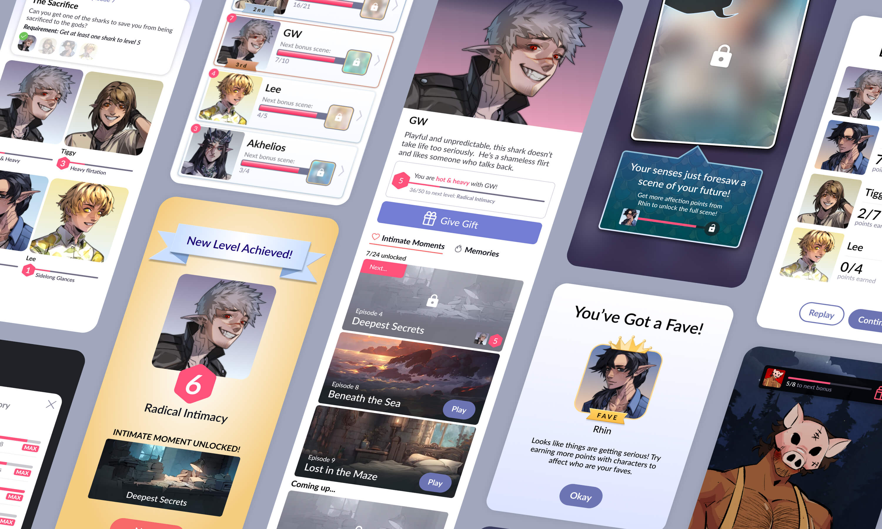
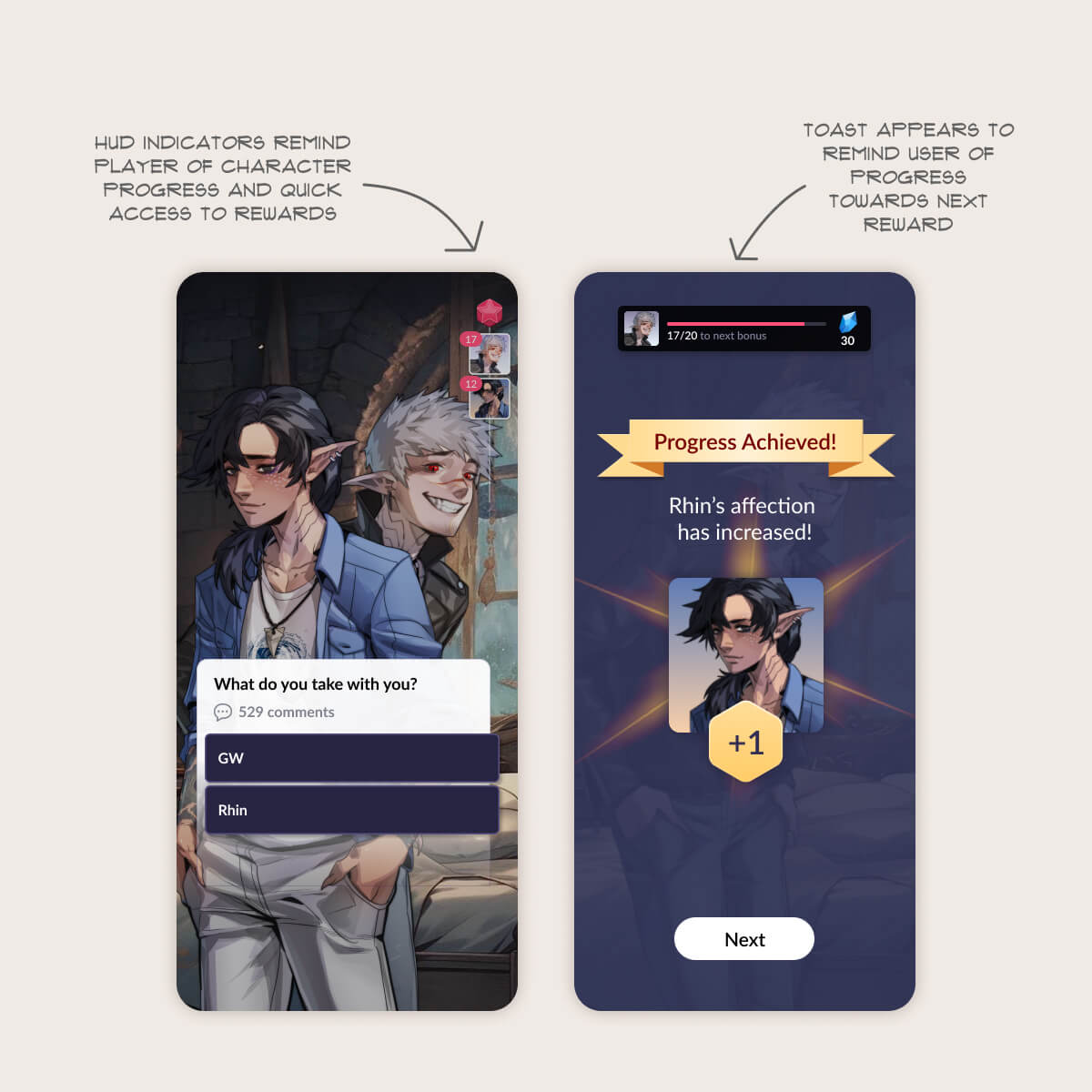
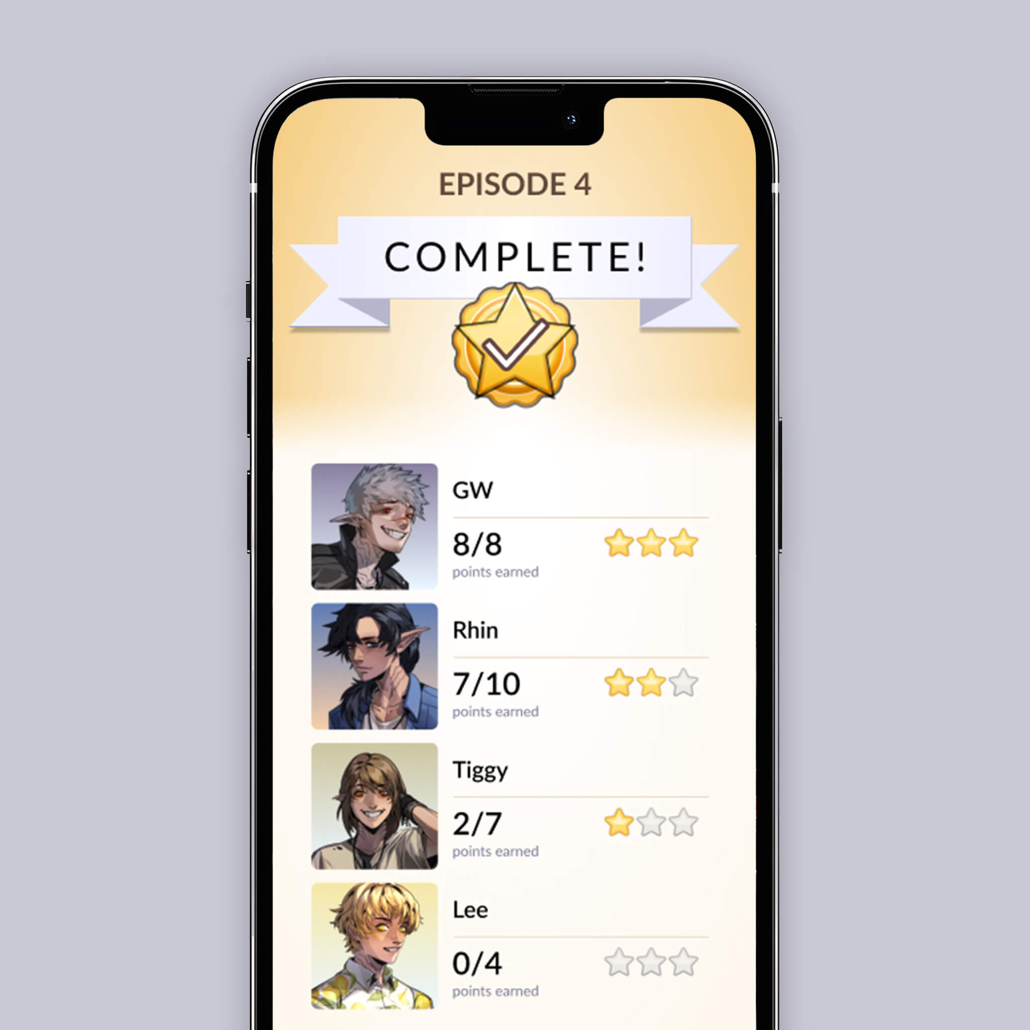
I designed a Goals system that any creator could add to their games, giving players explicit targets to work toward and visible progress tracking across all of them. Rewards were framed as character level-ups — not abstract point thresholds, but the sense that your relationship with a character was deepening as a direct result of your choices.
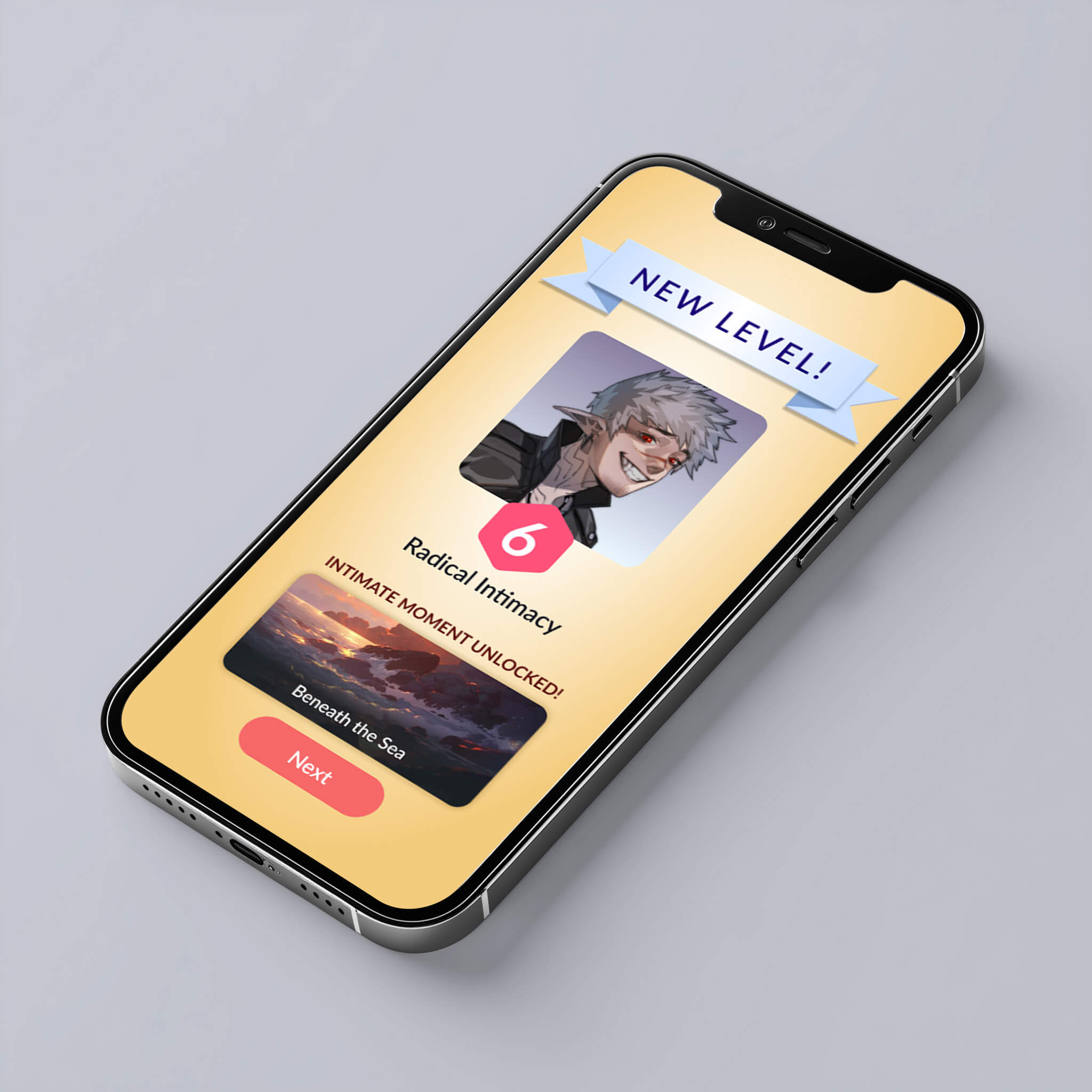
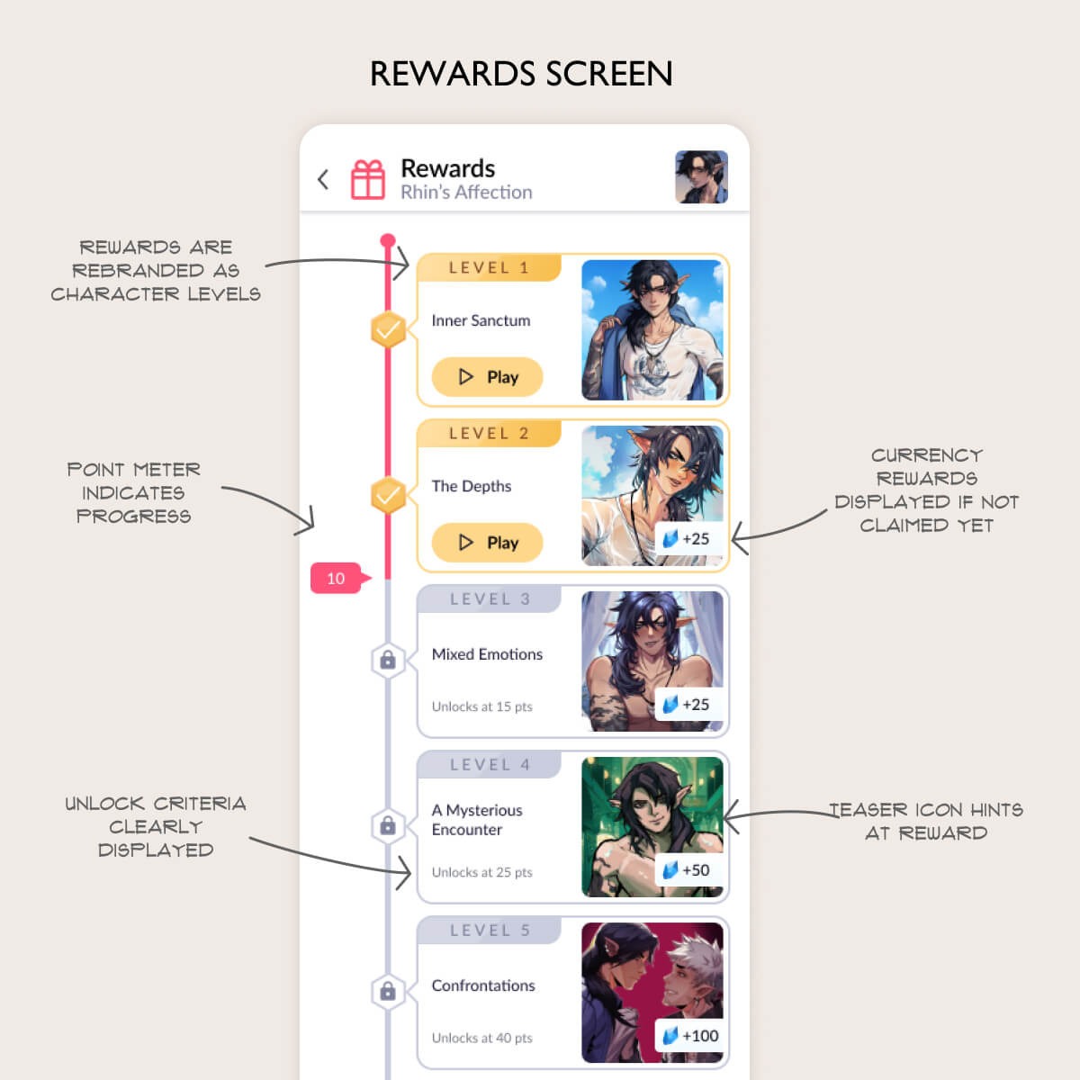
The central component was a new Timeline Screen: a single view where players could see all active goals, their current progress, and what rewards were ahead. The visual design and animation of level-up moments were designed to make progress feel earned and emotionally resonant, not mechanical.
I iterated heavily in Figma prototypes before any engineering investment, and the full rollout included A/B testing and user feedback loops at each stage.
Reflection
The retention problem at Dorian wasn't really about currency or content. It was about meaning. New users churned because nothing in the early experience told them what they were building toward or made them feel like they were making real progress.
The systems I designed — streaks, goals, progression, level-ups — are all answers to the same underlying question that drives retention in games, in learning products, and in any app where habit formation is the goal: what am I working toward, and does my progress feel real?
When the answer to that question is clear and emotionally satisfying, users come back. The 20% D7 lift is evidence of that. So is the fact that the system became a platform-level foundation that creators across dozens of games built their engagement strategies on top of.


George Rodgers
Dorian
From First Session to Daily Habit
The content was there. The reason to come back wasn't.
My Role
User Research
Product Design
Visual Design & Animation
Tools
Figma
The Core Team
VP of Content
VP of Marketing
Director of PM
VP of Engineering
Overview
Dorian is a UGC narrative game platform where creators publish and monetize interactive story games. The product had strong creator content and solid monetization — but too many new users were churning before they ever got hooked.
As Director of Product Design, I led the end-to-end design of a new retention system: from user research through systems design, UX, visual design, animation, and A/B-tested rollout across dozens of games.
The result was a 20% lift in D7 retention — driven by two interlocking systems designed around the same principle that makes learning products work: give users a clear sense of what they're working toward, and make the progress feel real.
Defining the Problem
My first move was research, not solutions. I ran rolling FTUE playtests to identify friction points in the day-one experience, and personally conducted 30-minute 1:1 interviews with our most engaged users to understand what was keeping them around.
The contrast between churners and retained users was sharp — and instructive.
New users churned because:
The product felt expensive, with no way to earn free currency
They didn't understand what they were working toward
Engaged users stayed because:
They liked the sense of building a relationship with characters
They liked feeling like their choices in the game mattered
That second finding was the more important one. Retained users weren't just consuming content — they were progressing toward something meaningful. They had a sense of investment and forward momentum that new users never got a chance to develop.
This is the same dynamic that drives retention in effective learning products: not the content itself, but the feeling that you're becoming something. The design challenge was to engineer that feeling from day one, before users had time to churn.
Solution 1: The Sapphires Economy
The cost perception problem had a structural constraint built in. Dorian operates on a creator revenue share model, which meant we couldn't distribute large amounts of free premium currency without cutting into creator earnings. The usual free-to-play playbook wasn't available to us.
So I designed around the constraint rather than against it.
I led the creation of a new platform-level currency — Sapphires — that existed separately from the creator monetization economy. Sapphires could be distributed freely to new users as rewards without affecting creator revenue at all.
To give Sapphires an earning mechanic with real habit-forming teeth, I designed a daily login streak system. Log in each day and earn Sapphires. Complete an episode on that day and earn a 2X bonus. The mechanic created a simple, repeatable daily ritual — the kind of low-friction habit loop that sits at the core of every successful retention system, from Duolingo's streaks to fitness app check-ins.
The streak was supported by a new Rewards screen that made progress visible and satisfying, giving new users an immediate sense of reward and a reason to return tomorrow.
Solution 2: The Goals and Progression System
The retention insight from user interviews — that engaged users felt like they were building real relationships with characters — pointed directly to the second solution.
Many Dorian games are dating sims. Players make choices that affect their relationship with characters, but the existing UI gave them no way to track that progress or understand what they were working toward. The system existed; the feedback loop didn't.
I designed a Goals system that any creator could add to their games, giving players explicit targets to work toward and visible progress tracking across all of them. Rewards were framed as character level-ups — not abstract point thresholds, but the sense that your relationship with a character was deepening as a direct result of your choices.
The central component was a new Timeline Screen: a single view where players could see all active goals, their current progress, and what rewards were ahead. The visual design and animation of level-up moments were designed to make progress feel earned and emotionally resonant, not mechanical.
I iterated heavily in Figma prototypes before any engineering investment, and the full rollout included A/B testing and user feedback loops at each stage.
Reflection
The retention problem at Dorian wasn't really about currency or content. It was about meaning. New users churned because nothing in the early experience told them what they were building toward or made them feel like they were making real progress.
The systems I designed — streaks, goals, progression, level-ups — are all answers to the same underlying question that drives retention in games, in learning products, and in any app where habit formation is the goal: what am I working toward, and does my progress feel real?
When the answer to that question is clear and emotionally satisfying, users come back. The 20% D7 lift is evidence of that. So is the fact that the system became a platform-level foundation that creators across dozens of games built their engagement strategies on top of.